For successful works, mastering the use and blending of colors is essential. As an introduction or a reminder, here are the basic concepts and principles to know!
Color Basics
Rate this tutorial
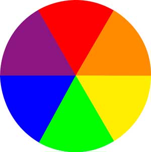
The Chromatic Circle
This diagram or pie chart will help you understand the principal relationships between colors.
Red is placed at the top of the circle, then, moving clockwise, orange, yellow, green, blue, and purple. A word of advice: in drawing or painting your own chromatic circle, you will memorize once and for all the relationships between colors. And posted near your workspace, it will allow you to verify good combinations in the blink of an eye.
Practical Advice
How to Create a Chromatic Circle: Draw a circle divided into 6 equal parts and apply the different colors, following the diagram. First, apply the three primary colors. For the secondary colors, mix an equal amount of pairs of primary colors, then apply them to the circle.
Primary and Secondary Colors
Within the chromatic circle, primary colors are found at 120⁰ from one another: red, yellow, and blue. They are called “primary colors” because they cannot be created by mixing other colors together. Conversely, they serve as the basis of different colors, which are called “secondary colors.”
Orange, green, and purple are the three secondary colors that can be created by mixing two primary colors. In the chromatic circle, each of them may be found between the two primary colors necessary to their composition:
- Red + Yellow = Orange
- Yellow + Blue = Green
- Blue + Red = Purple
Complementary Colors
In the Chromatic Circle, these are colors that are diametrically opposed. They work in pairs, composed of one primary color and one secondary color:
- Red and Green
- Yellow and Purple
- Blue and Orange
Memo
The complement of a secondary color is the primary color that does not play a role in its composition! Quick exercise: Since orange is made up of red and yellow, its complement is … blue!

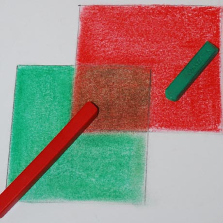
Juxtaposing Complementary Colors
Juxtaposed, the two colors of a complementary pair are equally intense. See for yourself by painting on a sheet of paper a red square within a green square and another red square within a blue square: red on green will appear much darker!
In practice, complementary colors allow you to bring vitality to your work, to animate or guide the eye towards important elements.
Trick of the Trade
In a sunlit landscape, where yellow and orange shades dominate, highlight shadows with purple or blue rather than black or brown: your work will gain vivacity!
Mixing Complementary Colors
The mixing of complementary colors lends itself to a range of grays and browns. You can vary the proportions of the mixture ad infinitum and thereby enjoy a very large palette of grays that are more or less cool, or browns that are more or less warm.
- When you blend a primary color and its complementary secondary color in equal parts, you will create “neutral” shades.
- When you blend complementary colors in unequal parts, these shades are called “colored grays.”
In drawing, as in painting, each tone is used in different ways:
- Use them as bases: other colors will better catch the eye.
- To soften a color that seems too loud, blend it with its complement. You will create a neutral shade, more luminous than if you had applied black or white.
- Mixing complementary colors creates shades that faithfully approach those found in nature (a field, a mountainside).
Warm Colors / Cold Colors
Found on the same side of the chromatic circle, warm colors are red, orange, and yellow. On the other side of the chromatic circle are cold colors: green, blue, and purple.
From a visual point of view, warm colors seem to advance and take up more space in a pictoral composition than cold colors. Conversely, less energetic cold colors appear to recede: for example, they allow you to give depth to a landscape.
As an artist, you seek to convey an emotion through your work. You should know that warm colors generate feelings of joy, energy, and excitement. For example, red evokes desire or danger, according to the subject represented in the painting. Cold colors are more soothing: they elicit less violent feelings, such as melancholy or serenity.
Have fun comparing the emotions that you feel when faced with a particular work, as well as the different colors used in its composition!
Black and White
Note: Black and white are not part of the Chromatic Circle. However, they are currently used in drawing and painting, particularly for blending. White softens and lightens other colors, whereas black is used to darken colors.
Recommended product:
1557® 180g/m²
See also :
Drawing
Drawing: Create a sketchbook