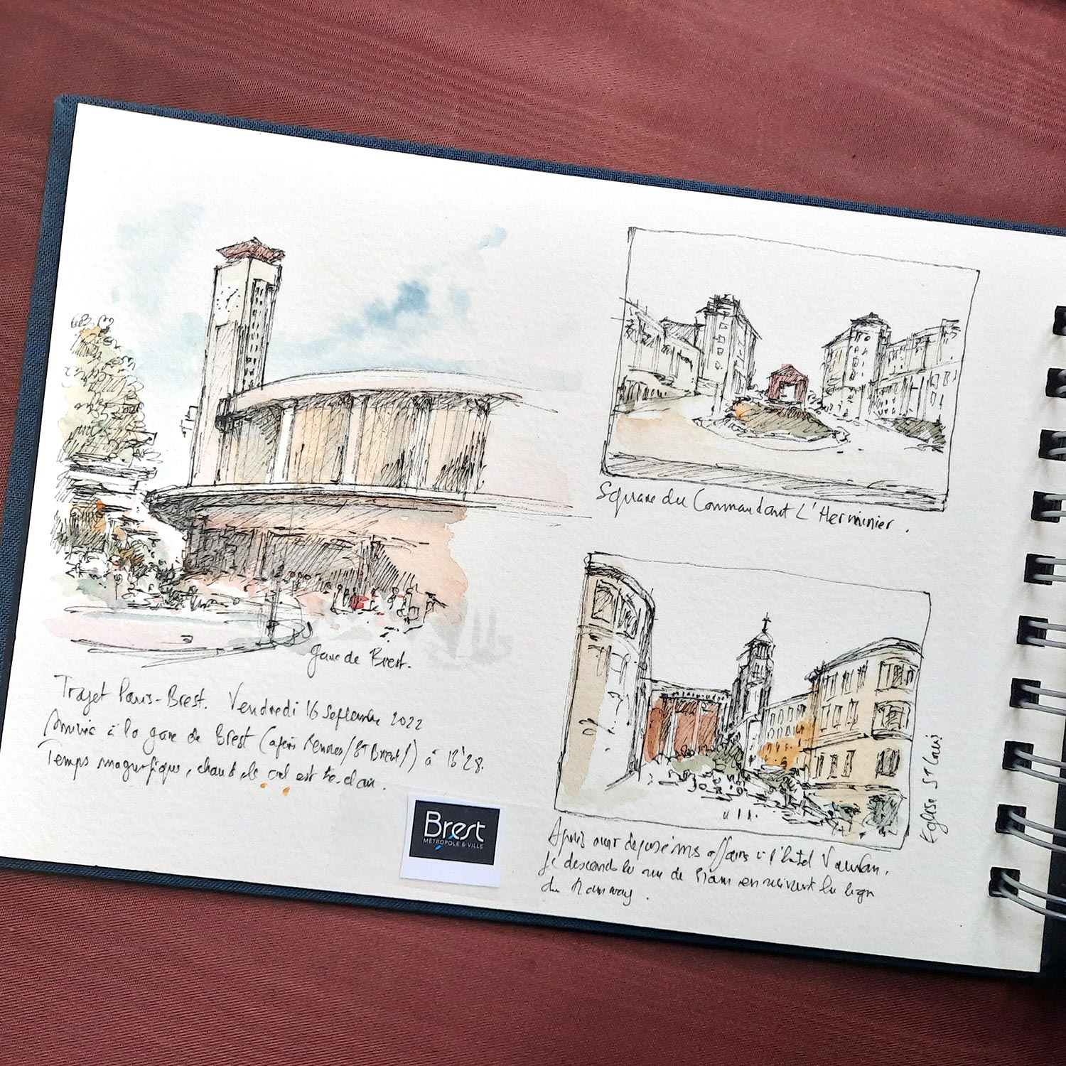
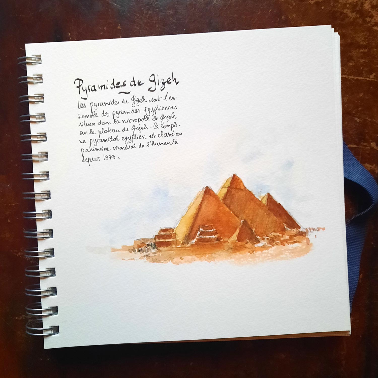
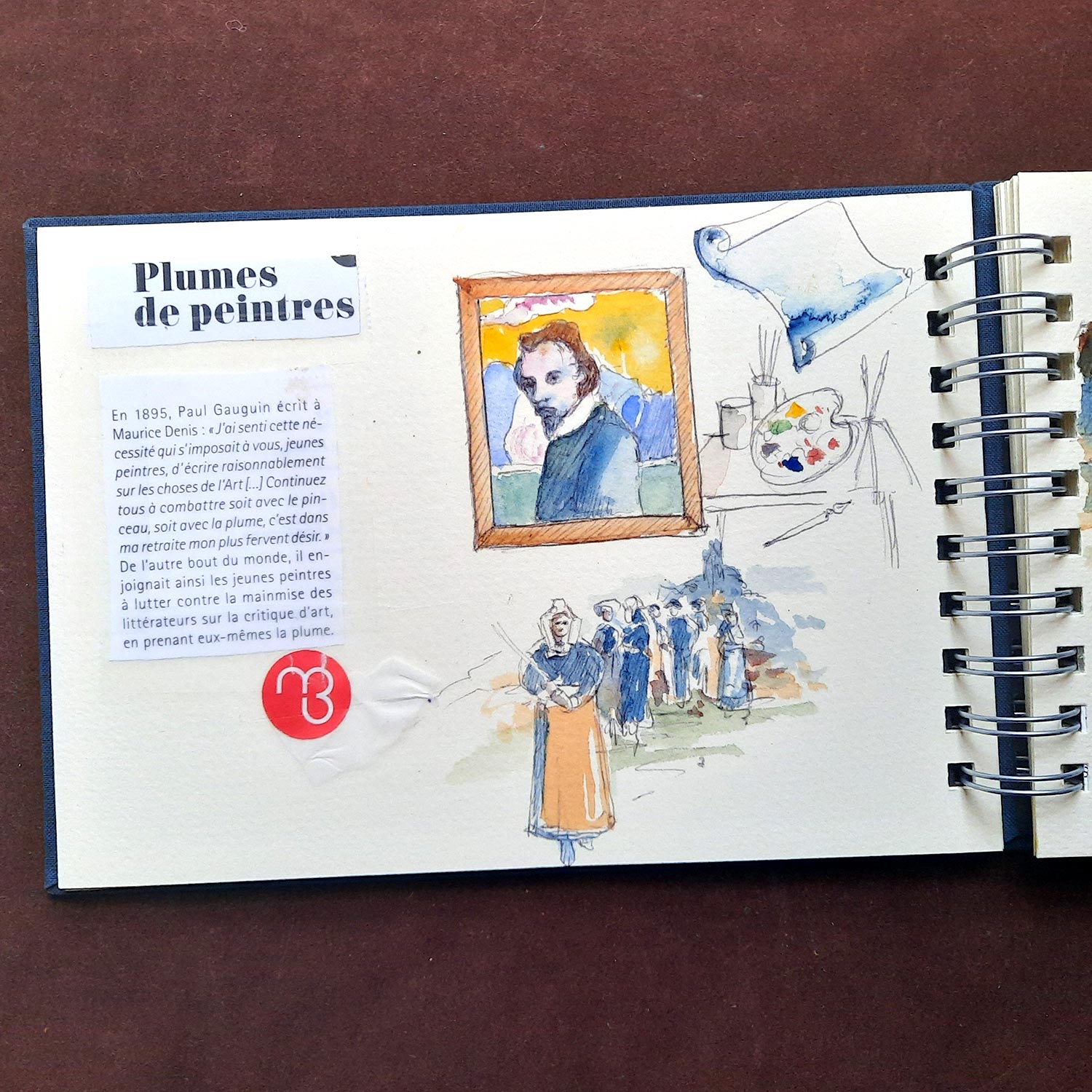
How to structure the pages of a travel sketchbook

Rate this tutorial
Average: 3.1 (7 votes)

The foundation of a travel sketchbook relies on three elements: image, text and empty space.

Combining these elements helps balance your pages.
It is not necessary to use all of them at once.
By varying the way you stage them, your sketchbook gains diversity and rhythm.

1. Picture

Whether it is a drawing, a watercolour or a collage (small sketches, museum tickets, stamps and so on), the image is the key element of any travel sketchbook. The Canson Montval Art Book is perfectly suited to all your creative wishes.

Whether you are a beginner or an experienced artist, each drawing carries an emotion. The aim is to integrate it well within the page.

Not everyone has the same level in drawing or watercolour. However, everyone can convey strong emotion with their own abilities. A quick watercoloured sketch can sometimes give more strength to your sketchbook than a highly detailed drawing.


Tip: if the subject seems ambitious, use smaller formats within the page. A viewer will more easily recognise a stylised monument than a large drawing where missing details may disrupt the overall impression.

2. Text

Text has two functions:
• to provide information (place, date and so on)
• to contribute visually to the page

The idea behind a travel sketchbook is to collect and compile what you see, experience or hear. These bits of information can be useful, yet they also act as visual ornaments. Take care with your handwriting. The finesse or thickness of your letters, their slant, contrast, capitals or lowercase, colour and placement all help bring your drawing to life. Writing with a blue, red or black pen can influence the overall chromatic balance of the page. It is up to you to find the harmony that suits your composition.

Hint: beautiful handwriting can enhance a simple drawing. Make the most of your strengths.

3. Empty space

Often forgotten, empty space allows the page to breathe. These silent areas give weight to the whole, adding graphic or poetic power.


Just like in a book, a piece of music or a film, pauses are necessary to highlight certain subjects. A page that is too full can distract the viewer and blur the main information. Leaving empty spaces creates a clearer view of what is drawn or painted.
 

Recommended product:
Montval®
See also :

Explore more tutorials on this technique

Watercolour
The travel album
Watercolour
Color Basics