
Still life: selecting colors successfully

Rate this tutorial
Average: 5 (2 votes)

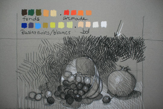
A still life is a composition of live objects! While the direction of the lines or paint brush strokes makes handling volumes easier, your perfect mastery of color is what gives them realistic contours.


What you need to know:

  • Objects, even monochromatic ones, display a broad palette of shades under the effect of light: a simple tomato calls for oranges, pinks and even browns.
  •  Only richly subtle shading will bring out all the contours.
  •  Lights and shadows are developed through tones of the dominant color.

1. Defining a tonal scale

  • Prepare your palette by gradually lightening and darkening each dominant shade to obtain rich shading.
  • Make sure you bring two or three colors into play: red and yellow, for example, to include the full range of orange shades in a ripening fruit.
  •  Bring the colors of the subjects into play to match the atmosphere you want: brilliant on a picnic tablecloth, the same tomato will turn brown on a wood table with candlelight.

2. Using darks and lights

In order to visualize the play of light clearly, make your source of light as bright as possible while you're making your preliminary sketches and getting the three types of shading facing you onto paper:

  •  The shadows being cast by each subject onto the medium, as opposed to the light source.
  •  The object's contours, where each protuberance "darkens" the area right behind it.
  •  The secondary shadows: each object in the light's trajectory influences the brightness of anything that is behind it.

Memo: a realistic rendering

Every drawing material captures light differently: shining on glass, more subtle reflections on metal, and hardly perceptible on wood…

Colors influence each other: a crimson tablecloth inevitably introduces a little warmth into the colors of the objects placed on top.

Recommended product:
Mi-Teintes®