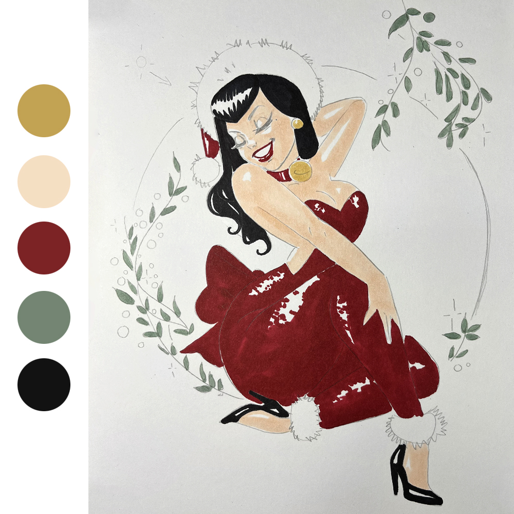
Materials required:
- Canson® Illustration® Manga® A4
- H or F graphite pencils
- Rubber
- Alcohol felt tips
- Gold felt tip
Materials required:
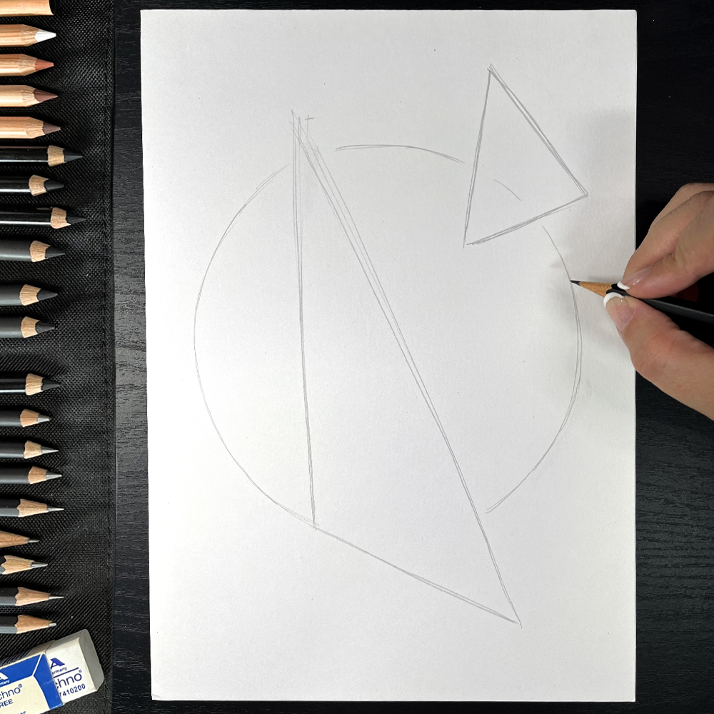
Choose the size your character will occupy in the space. Carefully observe its silhouette and the direction of the lines to get a result as close as possible to the model. Use a very light pencil (H or F) to sketch the shape. These are reference points that won't be kept in the final design.
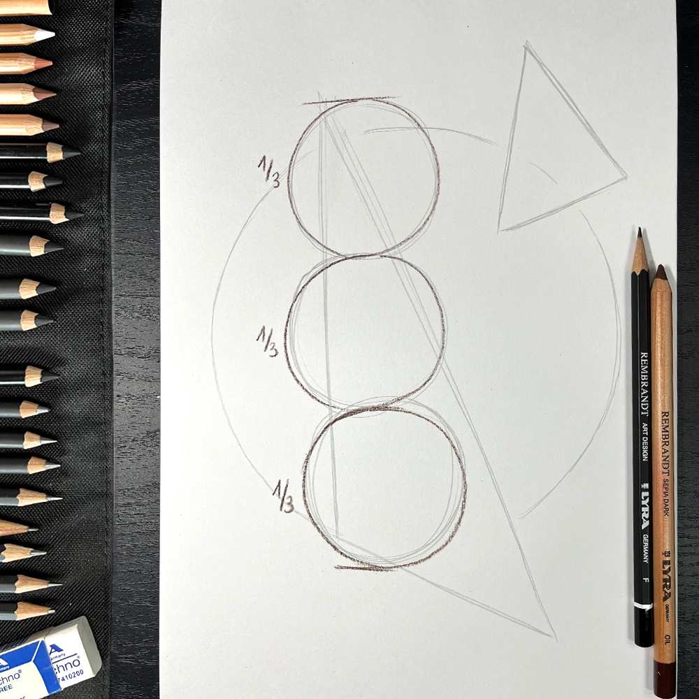
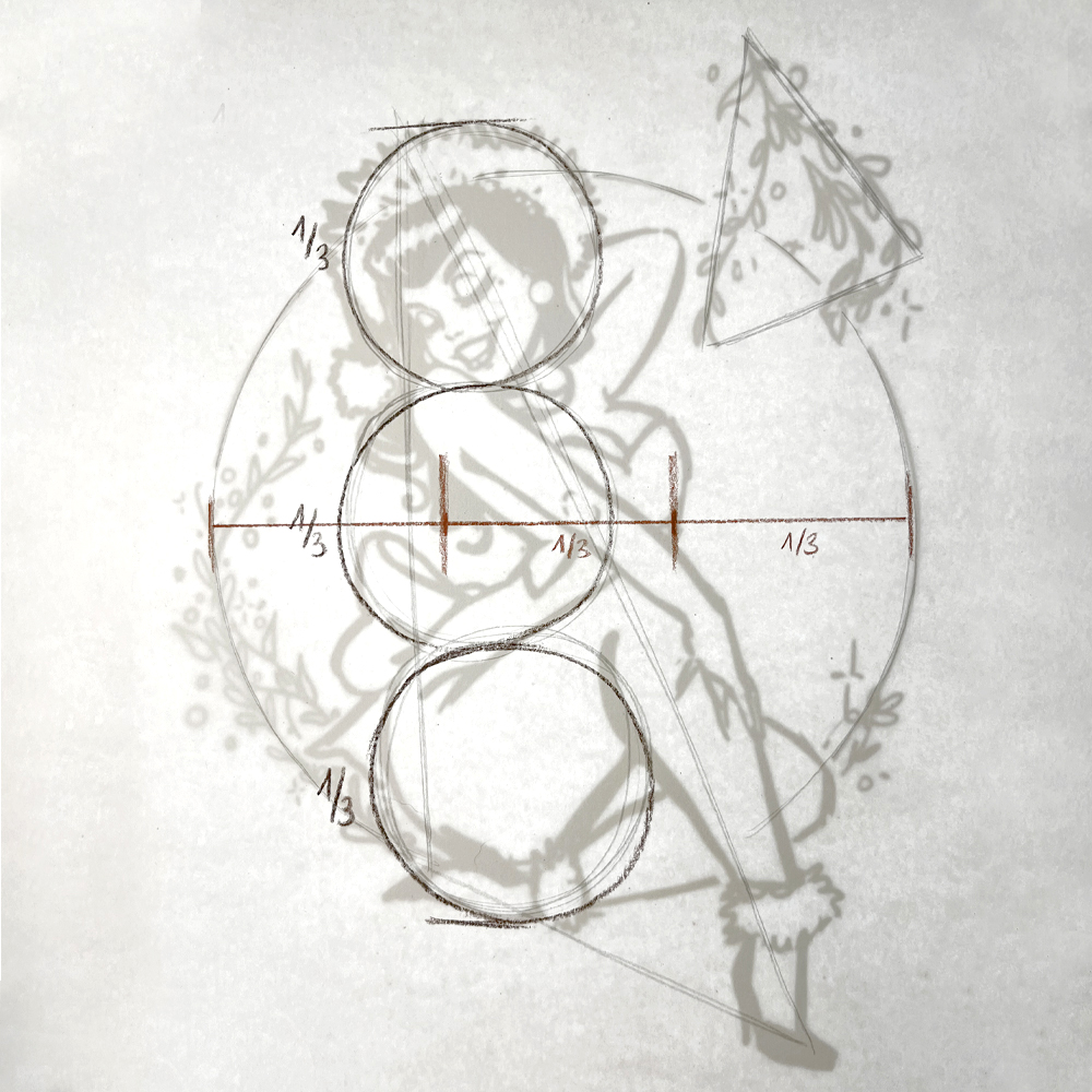
The proportions of the figure correspond to three circles of the same height.
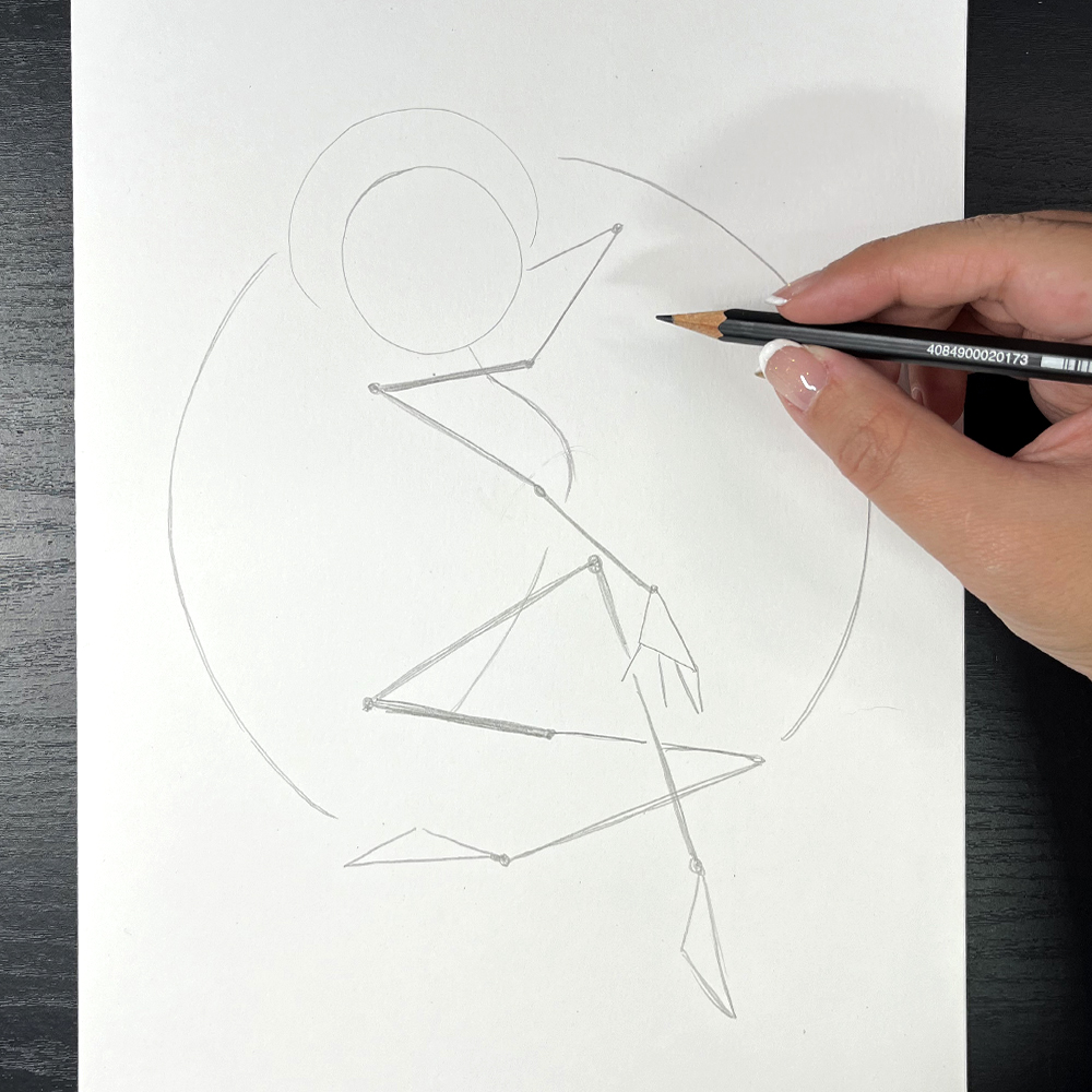
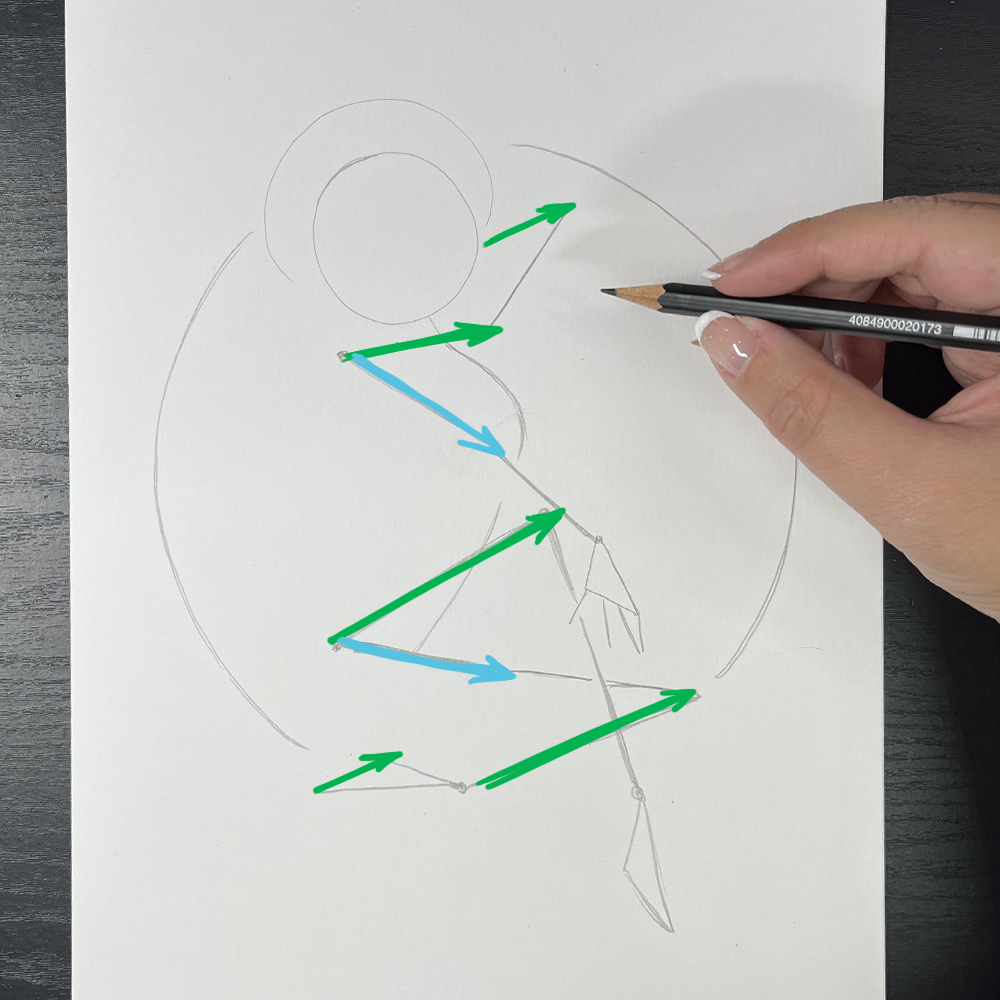
This is the stick figure technique, which will enable us to position the various structural elements in the right place.
Observe and be sure to follow the different directions. Using simple geometric shapes, the idea is to draw the guides that will ensure proper construction.
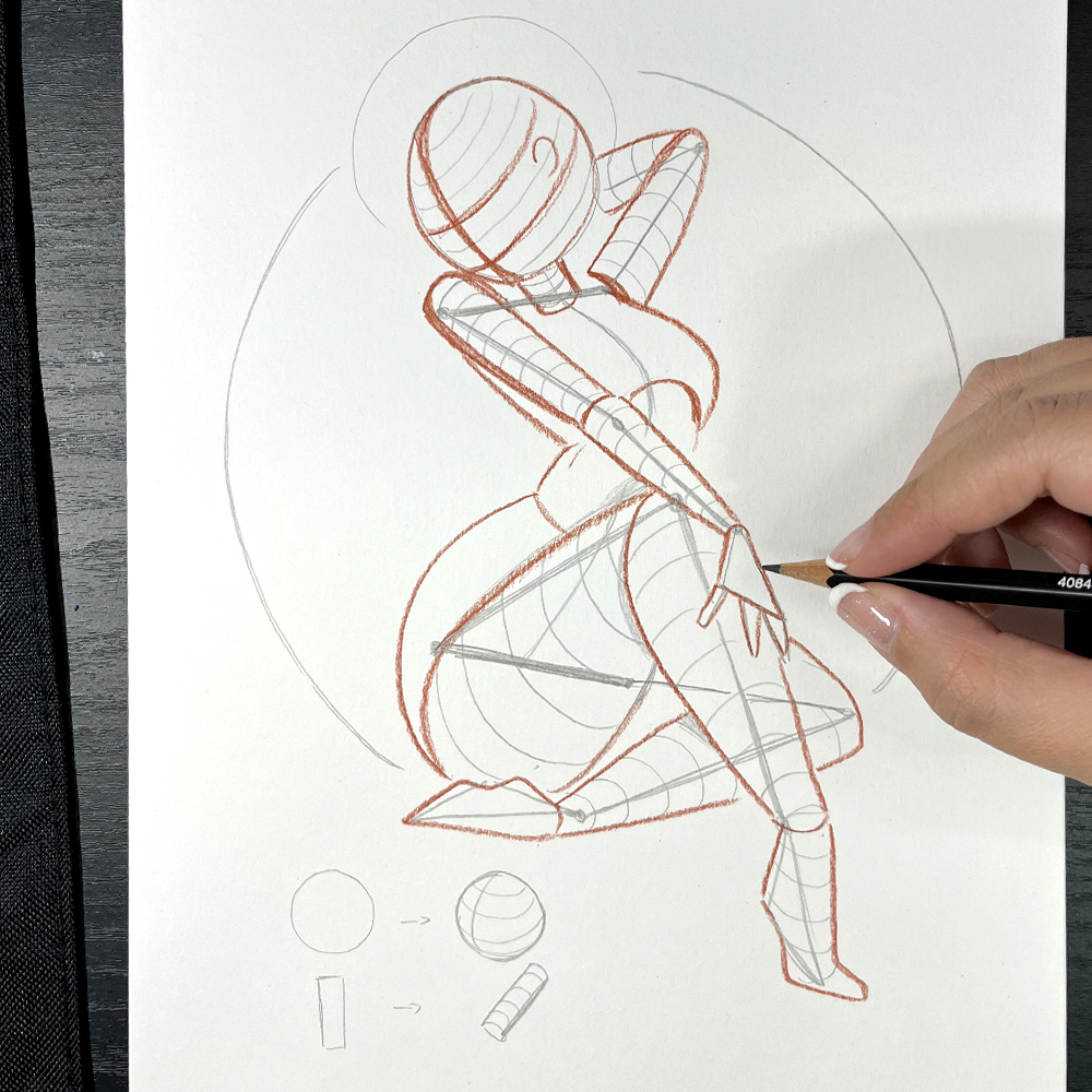
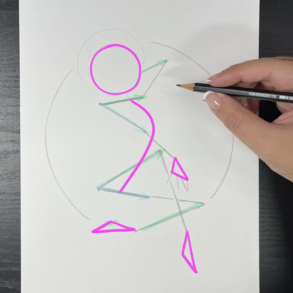
Before we get into the details and the trim, we're going to draw the volumes on top of our skeleton. The 2D shapes are articulated and thought out in 3D: the round head becomes a sphere, with the orientation of the face symbolised by a plus sign.
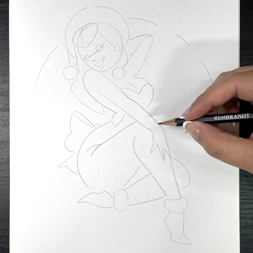
Little by little, the illustration will take shape by placing the elements of the face and adding the accessories. Be patient until you are happy with the result before moving on to the colour.
Start with the broad outlines and gradually add the details. Rub out unnecessary lines to clean up your drawing
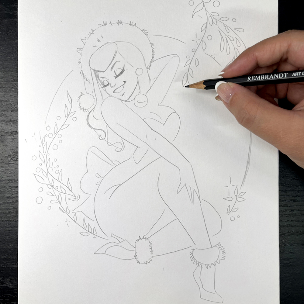
Tip: Use a light table to clean up your design. Overlay your draft with a new sheet of paper so that you can see your lines through it, and go back over them.
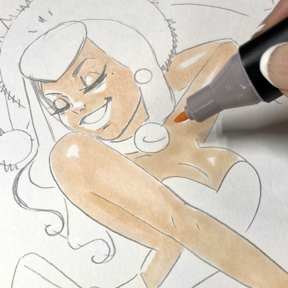
The pencil setting is complete. Apply the colour as a solid. We're going to enhance the design with colour, choosing the right light source to match the volumes in a coherent way. We need to think about the reserve areas that we won't be colouring in (these are the light areas).
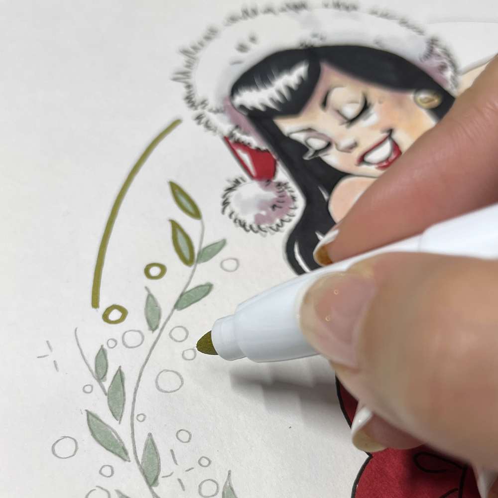
You can start by colouring the character's skin, then the red of the outfit, black for hair and shoes, yellow for bells and finally green for the leaves in the background.
Avoid going over the pencil to avoid smudging and "dirtying" the felt-tip colour.
Tip: For successful, seamless felt-tip colouring, keep the felt tip on the paper without lifting it. The more you go over an area, the darker it will become. Use the bevelled point for large surfaces and the thinner size for details.
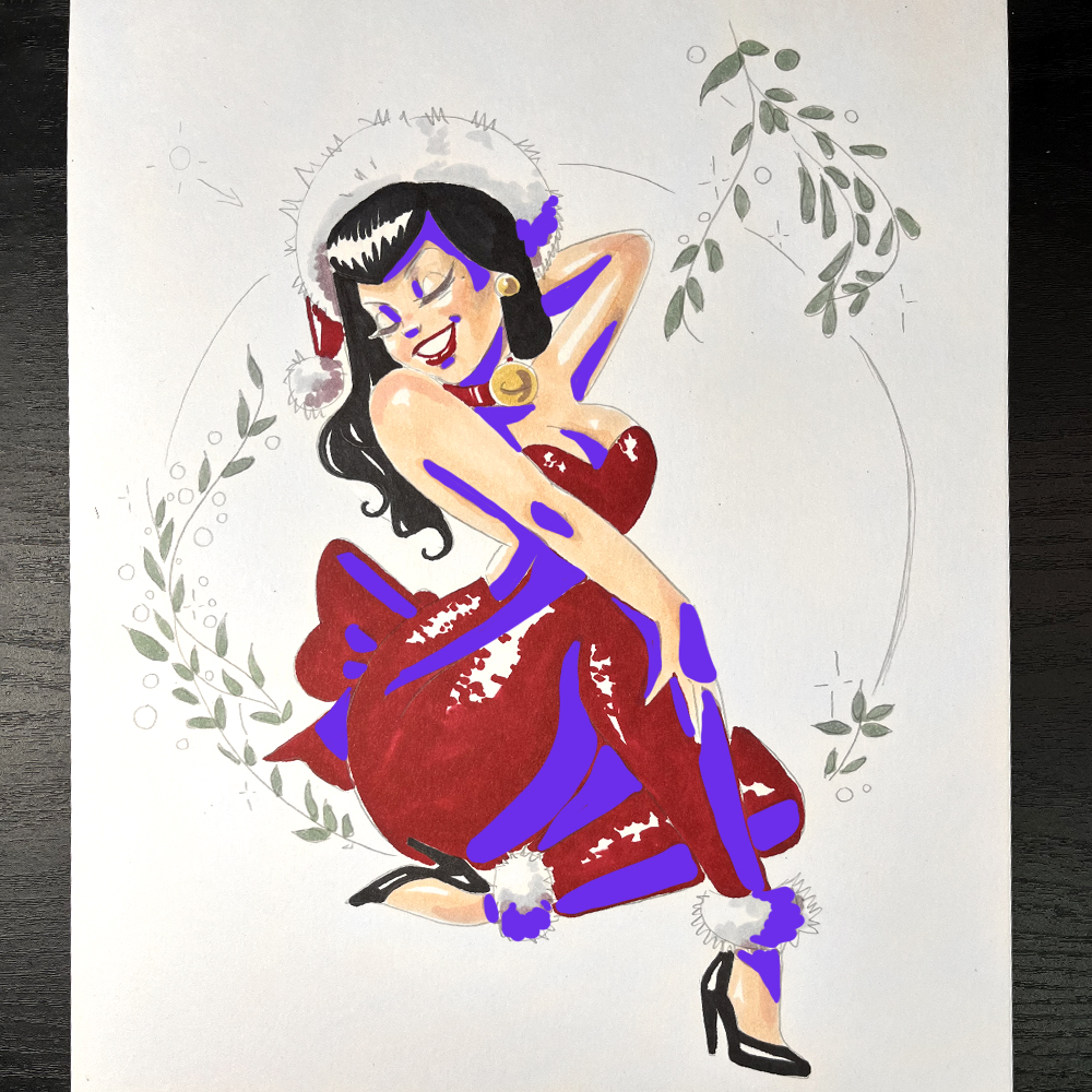
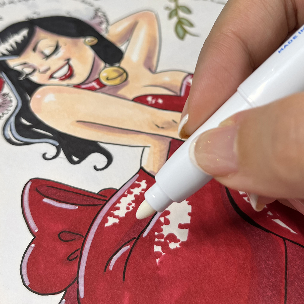
Add a colour for the character's shadow by superimposing. This will highlight the volumes and make the design easier to interpret. I use a violet that I place in the hollow areas and opposite to the light.
If the shadows are too pronounced, use the colour of the skin (or the lightest colour in the area) to superimpose it over the shadow, so that it blends in and softens the demarcation.
For a higher level of colour, you can vary the shades: certain parts of the face will be pinker, for example.
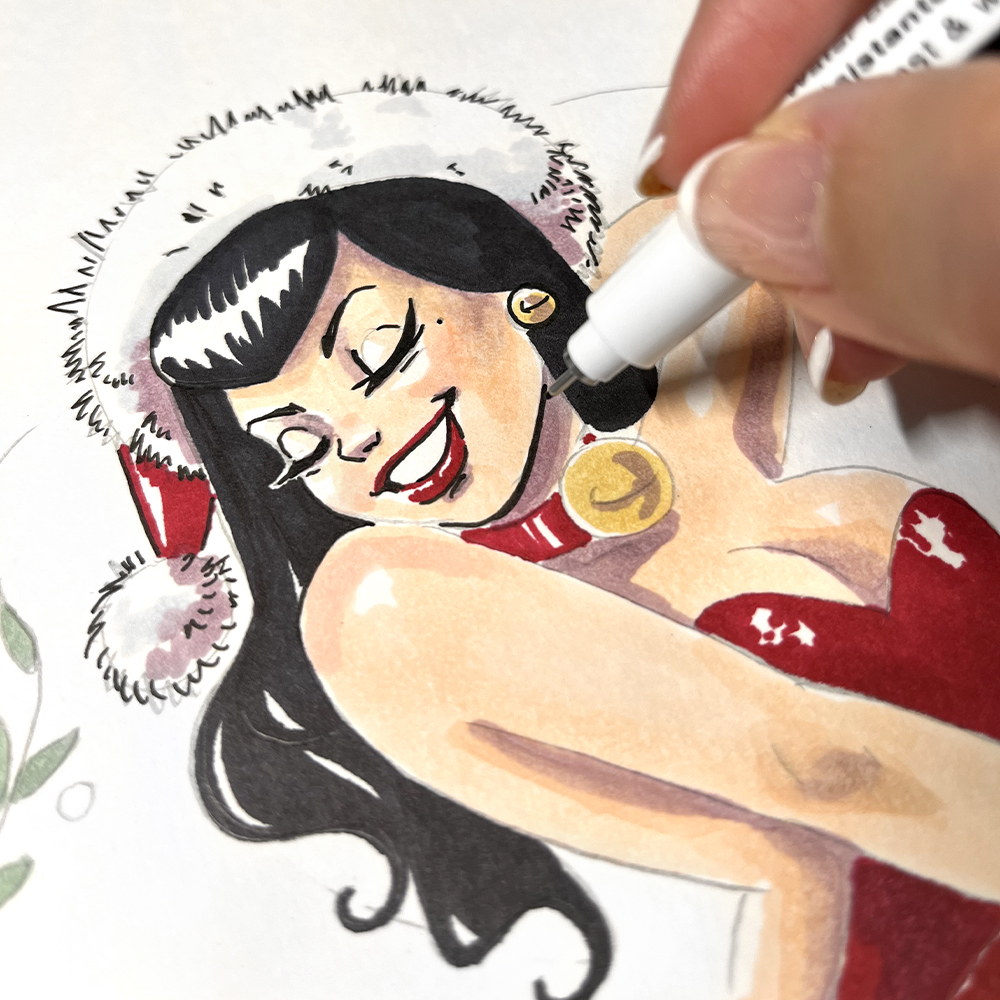
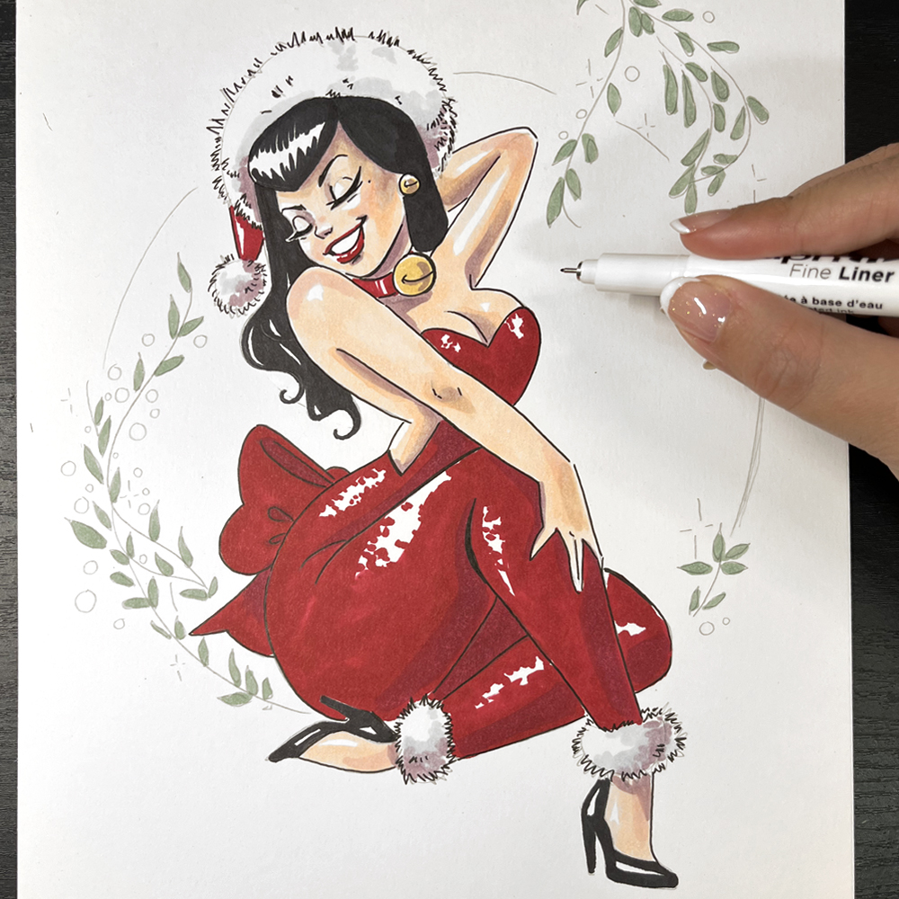
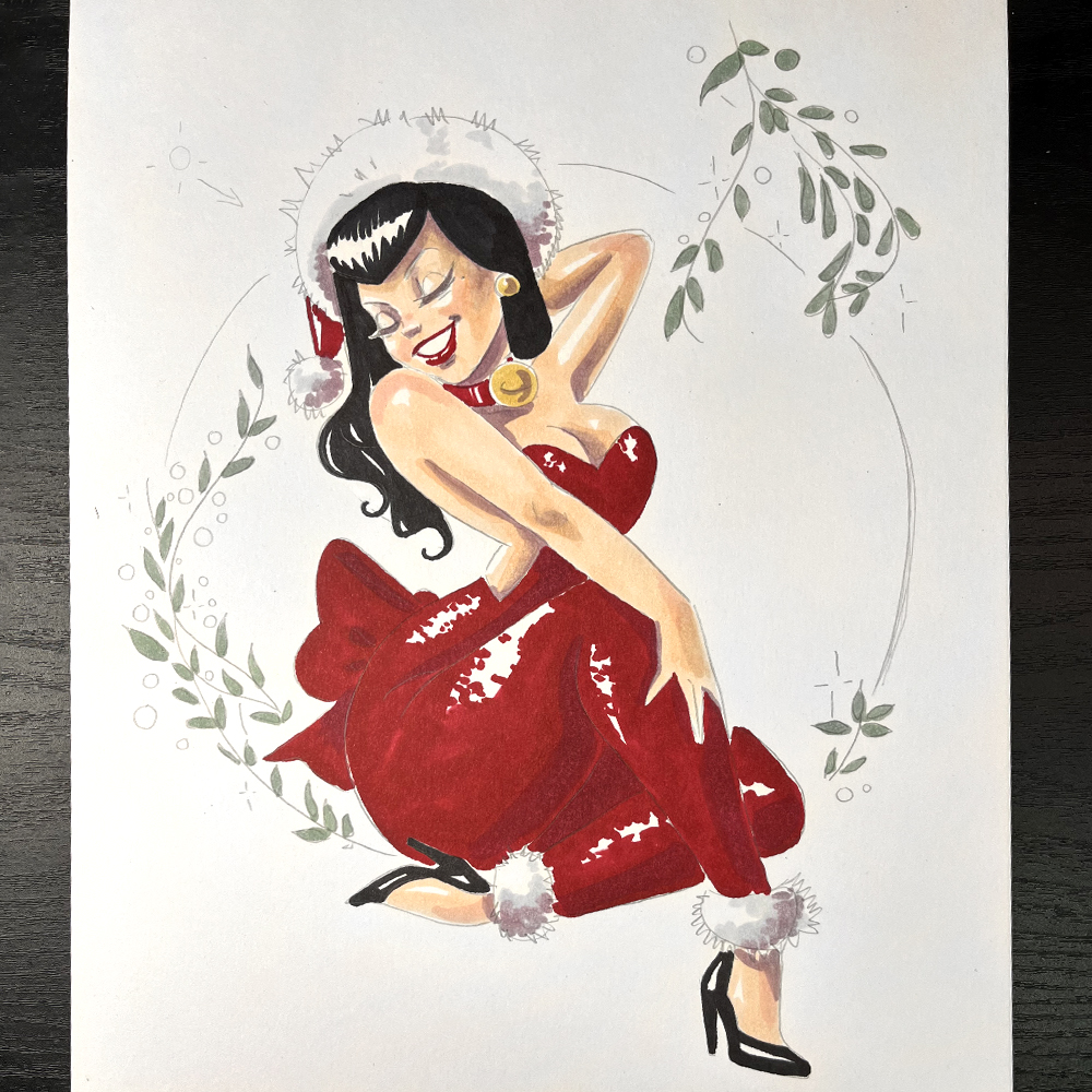
Go over the borders with a black felt-tip pen to add contrast and detail to the design. For this step, you can choose a single size of black pen and you can thicken certain areas.
As with the shadows, highlighting adds brightness and contrast to the design. Embellish your design with dots or white lines.
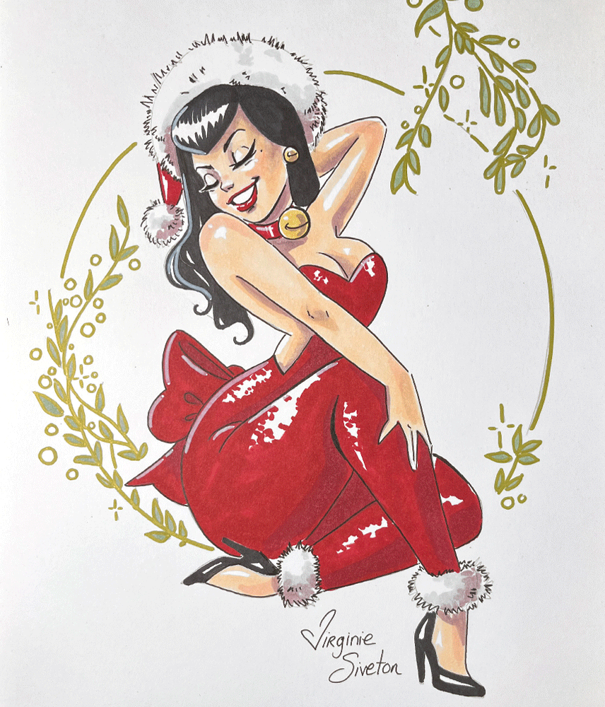
You can surround this Christmas pin-up with little green leaves when you colour it in. These leaves will guide the viewer's gaze around the character. For this final touch, you can use gold inking to separate the character from the background.
Well done, you've followed the tutorial step by step and got right to the end!