
Pastel & Colour: Chiaroscuro still life

Rate this tutorial
Average: 4.7 (7 votes)

Execution Time: 4:15 hours

Drawing: ½ hour   Adding values: ½ hour   Choosing colors: ¼ hour   Adding color: 3 hours

Level: advanced

Artist: Patrick Martin 

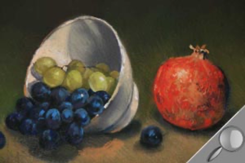
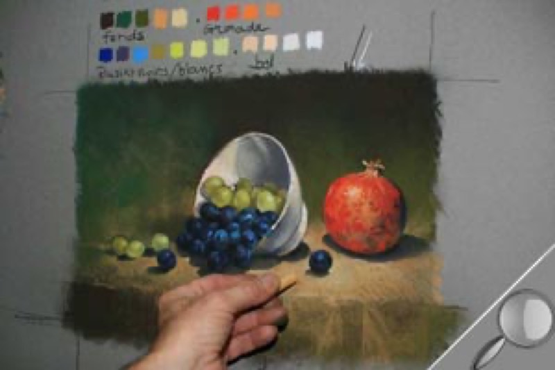
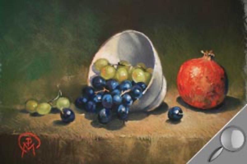
Fans of dry pastels, this tutorial was created just for you! This 9-step still life will allow you to tackle all the issues involved with this technique: choosing and composing your subject, choosing and assembling the colors, applying the right pressure to the pastel stick. The challenge of this exercise: creating an intimate atmosphere! Some advice: place your work upright on an easel, and set up the lighting of your model meticulously, because how you express the light that will bring your subject to life.
 

Material

  • Colors: Rembrandt dry pastels
    Permanent red 372.5; dark permanent red 371.5; gold ocher 231.7 and 231.9; lemon yellow 205.12; dark yellow 202.9; light orange 236.9; yellow ocher 227.5; Prussian blue 508.5; violet blue 548.3; phtalo blue 570.5; dark yellow 202.3; light yellow 201.7; raw sienna 234.5; olive green 620.3; raw umber 408.3; burnt sienna 409.3


  • Paper: Canson® Mi-Teintes 160 g/m2, felt gray
  • Accessories: 1 Pierre Noire black pencil 2B/1, 1 white lead, 1 kneaded eraser, 1 fixative spray, 1 rag, 1 board and 4 drawing clips (for attaching the paper).

Step 1

Creating the preliminary drawing.

  1. Use your Pierre Noire to put quickly sketch in the forms: fruit, bowl, cast shadows. Go light: that way, you can correct your mistakes with a kneaded eraser.
  2. Put more emphasis on some of the items in the composition: start with the bowl and organize the grapes so they look natural. Your line should be stronger: that way, your drawing will remain visible throughout the coloring stages.

Note: this drawing is the framework for your picture. It must be very precise. Do not hesitate to correct your mistakes or start again.

Step 2

Adding values

Step back from your subject and note how the shadows and light are positioned.  Use the white lead to: hatch the light areas; use to black pencil to hatch the shaded areas. Vary the effects by hatching closer together and farther apart.

To accentuate the contrasts, the gray of the paper needs to remain visible: make sure not to saturate it. Don't linger on the details (blink your eyes regularly and hard: this will give you a better overview of the areas to lighten and darken).

Step 3

Selecting colors.

Carefully observe the black and white grapes, the pomegranate, the bowl and the backgrounds. Create a color chart on the side of your piece to evaluate the colors and their relationships. Limit yourself to around twenty shades: that way, you can avoid weakening the overall harmony of the picture.

Note: banish black and white!

Step 4

Hatching the background and the tablecloth.

Put in the greenish background, then the tablecloth. Use hatching to add colors one by one, from darkest to lightest. Use the side of the pastel (break it into two or three pieces; save the extra along with a reference to the manufacturer). Take great care not to erase any of the drawing.

- Background: burnt sienna, raw umber, olive green; tablecloth: raw sienna, olive green, yellow ocher, gold ocher.

Step 5

Stumping the background and tablecloth.

With the end of your fingers (stumps and cotton swabs will remove drawing material), make circular motions. Work by color area (to keep from messing up the shades).

Pastels are very messy: take precautions! Use one finger per color; wipe your hands regularly with a rag.

Step 6

Working on the black and white grapes.

Hatch colors spontaneously, in a specific sequence, from darkest to lightest:

- Black grapes: Prussian blue, violet blue, phtalo blue.

- White grapes: green or yellow ocher, yellow ocher, light yellow, lemon yellow.

- Stalk: Pierre Noire pencil (showing) or phtalo blue, yellow ocher.

  1.  Add the darkest color then stump.
  2. Rework each grape with a lighter shade, without stumping, to add matter. Finish with a lighter dot. Work closely on the parts of the bunch you want the eye to focus on.

Step 7

Working on the pomegranate.

Work progressively.

  1. Add a light layer of permanent dark red then blend it, so it will cover and penetrate the paper.
  2. Work on the texture, without a stump. Add successively: permanent red, Prussian blue (for the cast shadow), gold ocher, light orange, lemon yellow (glints of light). To create true chromatic harmony, you can add specks of already used colors (violet blue, olive green etc.).
  3. Draw the details on the surface of the fruit with the tip of the pastel (you can pair any colors you want).

Step 8

Working on the bowl.

Add colors gradually. In the shaded areas: stump each layer directly. In the light areas: use impastos. Follow a specific order: yellow ocher, dark yellow, lemon yellow. You can add specks of blue to the bottom of the bowl (violet blue, phtalo, etc.). End with the rim: gold ocher for the darker parts, yellow ocher, lemon yellow (to define the line).

Step 9

Intensifying colors.

If necessary, readjust certain areas, particularly the ones located between the backgrounds and the objects (strengthen certain colors by defining the contours, for example). Next, add points of light to brighten the subject, by varying the intensity: for example, on the bunch of black grapes and on the single grape. Once you've finished your piece, set it on the floor and add a coat of fixative.

Trick of the trade

Before spraying, check the overall effect of the picture. Use a mirror to look at it: that way, you can see any flaws.