
Pastel & Colour: Abstract art: harmonizing colors

Rate this tutorial
No votes yet

Level of difficulty: novice   Estimated time: 1:30 hours

Artist : Frédéric Jalleau


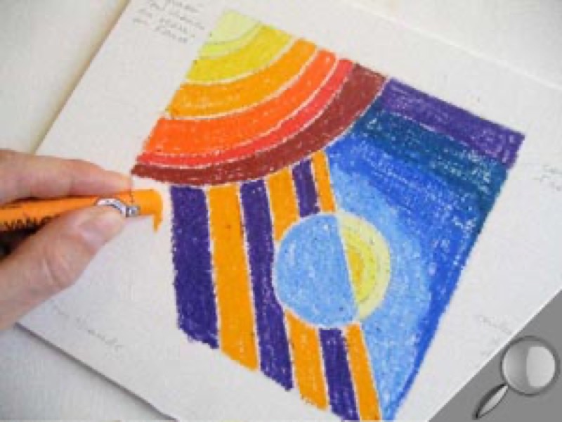
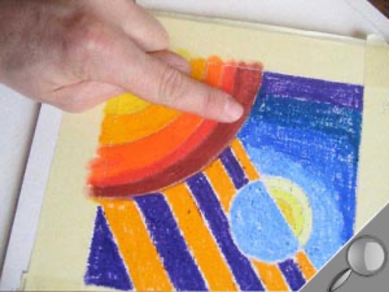
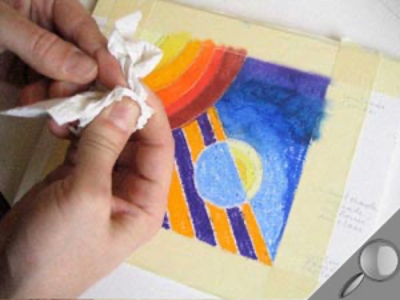
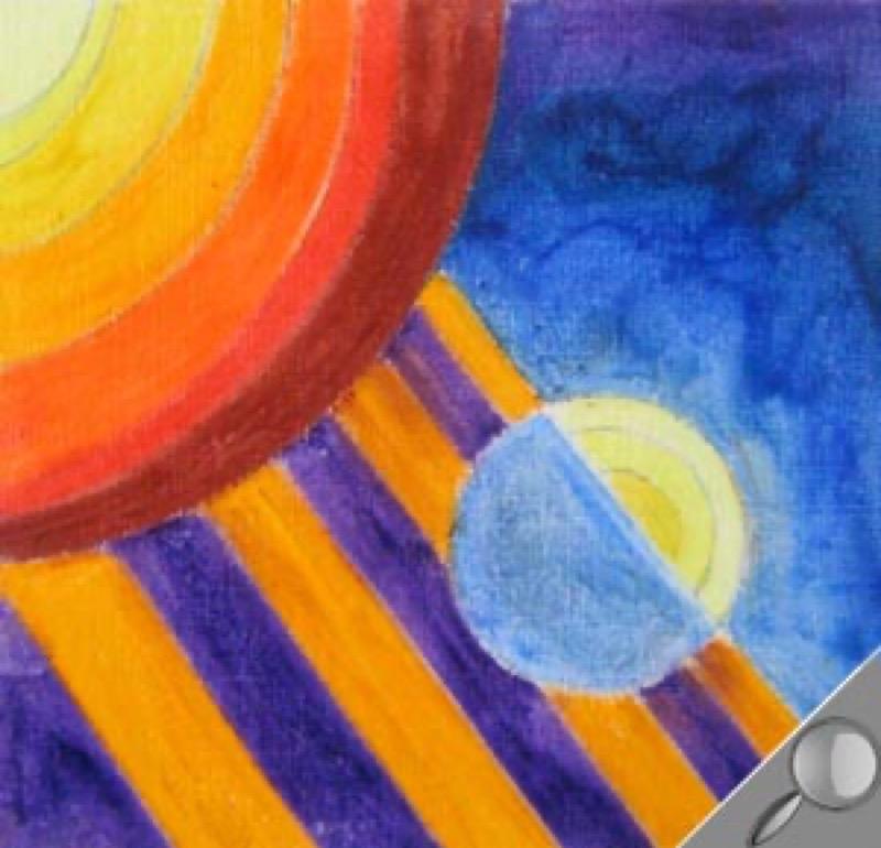
This simple geometric composition will allow you to learn about colors and how the interact, the basic principle of pastels! Your goal: sharpening your eye for contrast and the effect of colors in space. While waiting to move on to more ambitious creations…


Paper: Canson Figueras linen canvas textured oil painting paper 290g/m2 


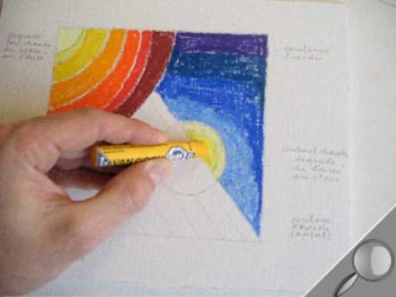
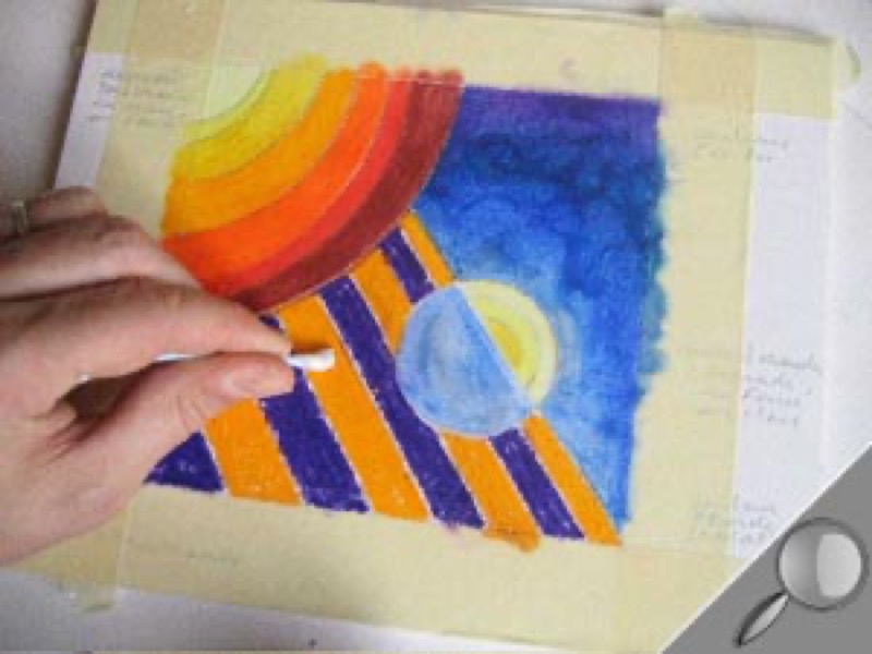
Colors: 11 oil pastels

  • yellow pale, light yellow, lemon yellow, and dark yellow
  • orange
  • vermillion, Indian red
  • bluish violet, Prussian blue, dark ultramarine, light ultramarine.

Pencil: 1 Criterium mechanical pencil


Accessories: cotton swabs, 1 roll of paper towels, 1 roll of masking tape, 1 spray can of matte fixative.

Step 1

Sketch the forms. 

Use the Criterium mechanical pencil draw a square. Inside it, draw:

- 1 arc of circle in the upper left hand corner

- 1 diagonal joining the lower right hand corner

- 1 circle cutting the diagonal.

Add curves to the arc of circle and to the upper half of the middle circle. Draw parallel streaks in the lower left hand area.

Step 2

Select the colors for your gradation. 

From a range of hot colors going from pale yellow to Indian red, select one pastel for each area of the arc of circle. Place them on your sheet of paper to make sure your gradation is harmonious. If you aren't sure, try the colors on a sheet of scratch paper.

Step 3

Create your gradation.

Starting at the top of the picture, fill in the defined areas one after another, leaving a little space between each shade to keep from messing up the colors.

Next, select your gradation of blues (from violet to light ultramarine).

Step 4

Add the blues.

Apply each color in succession, overlapping with the previous color.

Step 5

Alternate cold and warm shades.

Place the first three yellows used in the gradation in step 2 on the upper half of the circle.

Step 6

Add a solid blue area.

Use the last blue used in the gradation in step 5 on the lower half of the circle. Fill evenly.

Step 7

Emphasize the warm-cold contrasts.

Color the stripes orange (every other stripe) and purple, leaving a slight space between each of them.

Step 8

Smooth each color area.

First, tape the edges of the sheet of paper with the masking tape to protect them.

Step 9

Blur all of the blue area with your finger.

Work from top to bottom, making sure to wipe off your finger between each color.

Step 10

Refine with a cotton swab.

For details, the most delicate areas, and color transitions, use a cotton swab. 

Step 11

Spray the colors with fixative.

Leave on the masking tape and spray with fixative (note: go light!).

Remove the tape immediately, before the fixative dries and makes it stick to the support.