From a quick sketch to a finished work, worked down to the very last detail, you can create any interpretation with pastels. So long as you are orderly about it.
1. Start off on the right foot: think calculated spontaneity
- Even if brilliant idea frequently fuel inspiration, it doesn't hurt to spend a couple of minutes imagining your future work. This exercise is especially helpful for selecting the right paper: texture, color, the potential added value of a personalized background, etc.
- Next, sketch at least the major masses with light charcoal or square pastel (also called "hard" dry pastels), including shading the elements composing the subject.
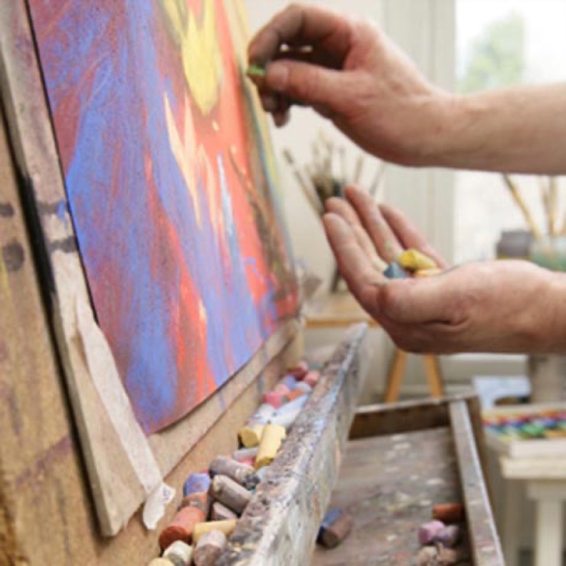
2. From large colored areas to smallest details
- Start by lightly coloring the main forms with the edge of a square pastel. This will give you a general idea of mass and tone balance.
- Next, apply soft pastel color more liberally (the color will be denser).
- Gradually blend and shade your colors, superimposing layers to make the shades denser.
- Introduce secondary aspects and any foregrounds.
- Work on the volumes of the various subjects and add details.
- Finalize your work by accentuating the contrasts with touches of dark or white pastel.
Trick of the trade: Organizing where the colors will go
At the least in the beginning, make an effort to keep your progress on all areas of your work at the same level. No doubt you will have the impression of handling a lot of pastels without producing anything definitive, but you will end up with a consistent composition.
Working with oil pastels
- Work by superimposing thick layers of color after doing a sketch with sweeping oblique lines. Unlike dry pastel, there's no need to worry about saturation.
- Get used to defining large masses before adding details.
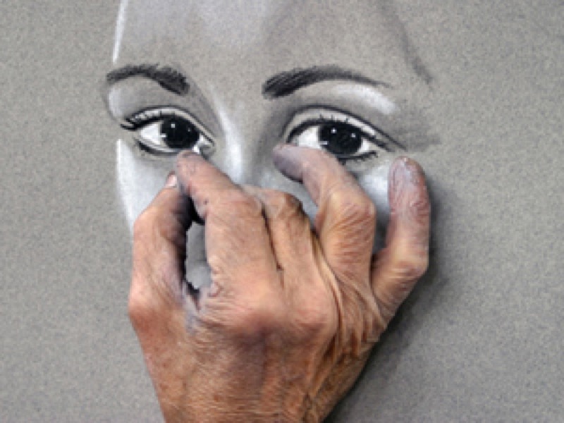
3. Shading and highlights: how do you liven up your picture?
Just as the loveliest of landscapes can look dull on a rainy day, shading and dashes of light (called "highlights") will add the most life to your work and accentuate the your subjects' volumes.
Shading is done in dark tones, such as charcoal. It has two purposes: "placing" a subject by drawing a shadow located opposite the supposed source of light; and consequently shaping the contours.
Highlights are usually dabs of white pastel: whether applied lightly or firmly, they pick up already present colors, creating a harmonious luminosity. To keep the other pigments from being contaminated, apply the highlights last.
Practical advice: Working on contours
While wandering around in the great outdoors, note how the sun has affects the landscape’s colors and contours. Squint your eyes to tell the difference between brightly lit areas and the duller ones in the shade.
Practice at home by setting an object or piece of fruit on a table and placing a lit lamp on one side of it:
Quickly draw the subject, adding a solid area of color.
Reproduce the shadow being cast the way you see it.
Hatch the lit side in white, and the one opposite the light source in black. It just takes a few lines for its volume to stand out!
Recommended product:
Toned "C" à grain® 250 gsm
See also :
Pastel
The difficulties of pastel