Dare anything and do anything with gouache. Gouache is also the easiest technique to master… once you get the hang of it!
1. Making the most of opacity
Gouache consists of colored pigments, a binder (often gum arabic) and water. It produces a velvety matte finish, in powerful shades.
Because it is opaque, you can paint layer upon layer with it:
-wet on dry: adding details onto already dry paint. Each shade remains quite separate from the previous one.
-wet on wet: a color is applied over the previous one while still wet. This delicate technique requires speed and precision.
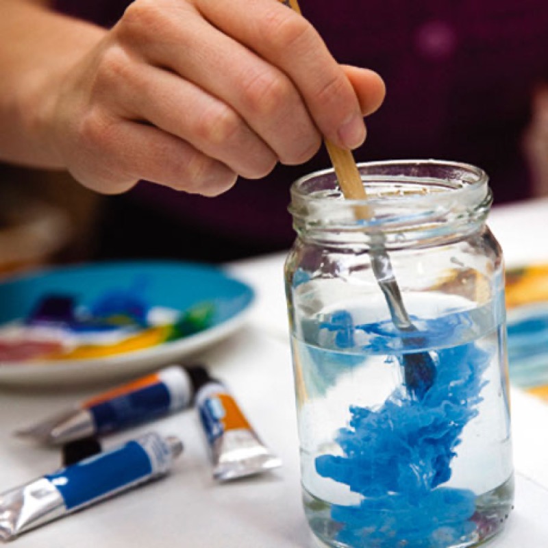
2. The right amount of water
It varies, depending on the rendering you want to achieve Diluting gouache allows you to approach watercolor rendering and to do washes.
A classical, moderately diluted preparation should be soft (a little like mayonnaise!): when you shake a paintbrush loaded with paint, just one drop should fall off.
You can also use pure gouache with energetic strokes and a dry paintbrush. Note: most works combine various techniques.
3. From background… to details
Start by doing a pencil sketch, at least to place the major masses. Paint the major background masses, then the large color blocks. Finally, add a series of details, shadows and lights, to create depth.
What you need to know: Unlike watercolors, you can lighten a shade. This is why applying dark colors first is recommended.
Tip: Light or dark?
To lighten a color, add:
-some white: take some of the original color and create a new nuance by adding a little white gouache.
-some water: the shade with lose in opacity, but become lighter… and stay the same!
Conversely, to darken a shade, add:
-some black (or a darker color): but watch out, the result can sometimes be disappointing!
-layers in the same shade: adding more paint will make a color subtly thicker.
4. A few mistakes to avoid
Avoid adding too many thick layers. These "impastos" are likely to flake and peel once dry.
Instead of continuing to add shading and light to salvage a less than convincing volume, you'd be better off covering it with a new color block… and starting over again!
Turn your work to observe it from various angles. Some perspective errors sometimes show up best when viewed sideways or upside down!
Put some distance between you and your piece: by taking a step back and squinting slightly, the contrasts will stand out.
Load your brush enough to paint your color blocks in a single sweep. For large areas, tilt your board towards you and paint a series of horizontal stripes, starting at the top.
Do not add too much white to your colors… They will fade when dry.
Use everything that can help you. You can draw straight lines without leaving smudges by pressing the ferrule of your paintbrush against a ruler positioned obliquely to the paper.
It's okay to draw fine details with a pencil… instead of seeing red!
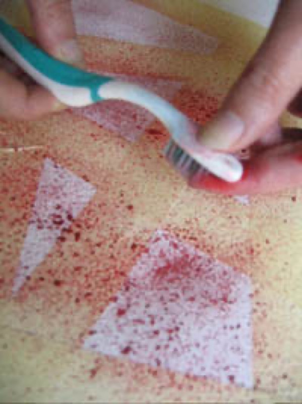
5. Did you say texture?
Opacity does not necessarily mean uniformity. Some techniques can make plants, mineral surfaces and other flowing waters look more natural than nature:
Create ripples with a comb, spatter some droplets of paint by pulling back the bristles of a toothbrush, to liven up a foamy sea or a mass of vegetation.
Add color with a sponge or wipe it off irregularly with a dry rag to increase its texture.
Apply a wash to soften contrasts.
Recommended product:
Imagine
See also :
Gouache
Gouache: Selecting your material