
Acrylic: Port at dawn

Rate this tutorial
Average: 5 (1 vote)

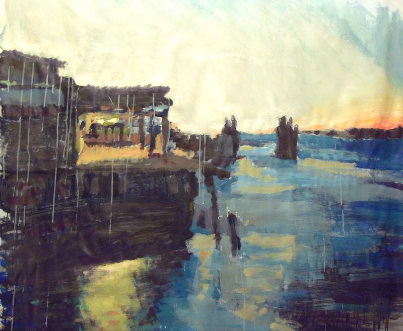
Format : 150 x 120 cm  Execution time : 3 hours  Level : difficult

Artist: Dariuzs Krepcinsky 

An atmosphere-based theme, like a port at dawn, done in a large format, affords the ideal opportunity for you to get used to and play around with the chromatic possibilities of acrylics. Especially very dilute acrylics, applied with a brush and scumbled. Some advice: Do a preliminary, small format sketch to plan where you'll place your colors. 


Material 

  • PaperCanson® Acrylic  
  • Acrylic colors: primary yellow, red and blue in tubes; 1 tube of burnt umber; 1 tube of white
  • Pencils and paintbrushes: 1 B lead pencil, 2 paintbrushes (medium large and medium).
  • Accessories: 1 jar water, 1 jam jar, 1 palette

Step 1

Do a quick pencil sketch of the subject.

On the Canson® Acrylic  paper, draw the subject's main points of reference with light, quick pencil strokes: the port facilities, horizon line and rocks. Don't focus on details or drawing accuracy.  

Step 2

Adding the colored background.

Add blue to the jam jar. Cover with about 1 cm of water. Mix vigorously until your colorwash is uniform.

Load the large brush with the colorwash and use it to cover your drawing and the sky in the right corner. Apply the paint unevenly, holding the medium upright. Set a little colorwash aside.

From now on, just use the medium brush. 

Step 3

Defining forms and adding dark masses to structure the painting.

1) Add 1/3 blue and 2/3 umber to the colorwash. Moisten the brush before and after loading it with color, then apply as a scumble (when heavily loaded, your paintbrush will leave traces) on: the bottom right corner, port facilities, horizon line and trees.

2) Dilute the rest of the mixture and apply to soften the contrasts: light reflecting on the water, shadows and shading around the dark masses. Allow to dry.

3) Add pure blue to your palette: moisten the brush before and after loading it with color. Paint the blue parts of the port facilities quickly, applying the paint thickly.

Step 4

Adding color areas: work from darkest to lightest.

Do this by associating and building up different color areas. Proceed by area:

  • The port facilities
  • The water
  • The sky

Allow to dry between each step. 

1) The port facilities.

- Brown: mix some umber, a little less red and yellow, and 1 dash of blue. Apply quickly as a scumble.

- Yellow orange: add a lot of yellow and 1 dash of red to the preceding mixture. This will yield an orange yellow.   

2) The water: prepare 4 color mixtures.

  • Dark violet (blue, red + 1 dash of brown): on the bottom and in the left and right corners.
  • Dark blue (blue + 1 hint of brown): under the horizon line, in the bottom right corner and in the left corner.
  • Neutral gray: dark blue + yellow + 1 hint of red: add it to white spaces. You should achieve the effect of water and transparency: do not overload your paintbrush.

- Cyan: neutral gray + blue + white.

Finish off with the turquoise area located under the port facilities (cyan + blue + yellow + 1 dash of brown).

3) The sky.

Go back to your cyan mixture: add some yellow, blue, white and 1 dash of umber. This should yield a very light turquoise. Mix well: this will yield a uniform shade; mix less vigorously: traces of each color will remain.

Load the brush, dilute liberally and paint the color on vigorously.

Step 5

 Brightening the subject.

Go back to the color mix for the sky. Add some white. This should give you a luminous gray: brush it onto the sky. The color should be very diluted.

Soften overly strong color transitions, particularly the blues. 

Step 6

Playing up contrasts: the sky and the water.

- The water: mix yellow, a little red and some white. Load the brush and dip it into the various previously created blues. Mix well. Apply as irregular dabs, so the sun shows as reflecting on the water.

- The sky: mix some yellow, white and a little more red than previously (this will yield a more orangey color. After diluting, apply to the sky to soften it. 

Step 7

Adding the final touches.

Prepare a violet (80% blue and 20% red). Correct your dark masses as well as the contrasts in the right and left corners, highlighting  the architectural elements (window and pillars) along with the horizon.