
Watercolor: Seascape under stormy sky

Rate this tutorial
Average: 3.5 (11 votes)

MaterialLevel: advanced / Time : Preparing the paper: 1 and a half hours Time of execution: 2 hours 

Artist: Gally Mathias. 

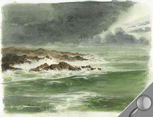
A seascape under a stormy sky, with its strong contrasts, is an excellent exercise for learning to hone your effects: Transparency, shading, reflections, the interplay of shadow and light, motion, etc. Can be reused with any subject!

Material

  • Paper: Canson Montval 200 g/m2 watercolor - fine grain
  • Colors: Sienna, red, emerald green, ultramarine blue, cadmium yellow, 1 tube white watercolor or white gouache
  • Pencils and paintbrushes: 0.5 mm HB mechanical pencil, wash brush, round pointed brush (squirrel: Windsor and Newton N° 6) medium, fine round pointed brush (sable, Isabey N°1)
  • Accessories: 1 kneaded eraser, paper handkerchiefs, 1 sponge, 1 wood board (larger than the sheet of paper), 1 roll adhesive Kraft paper

Step 1

Attach paper Canson Montval to board to keep it from buckling while you're working.

- 1) Submerge your paper in the water.

- 2) Wet your board with the sponge and put the sheet of paper on it: it should not buckle (if it does, dip it in the water again).

- 3) Moisten the Kraft paper with the sponge and attach the sheet of paper to the board. You can also use tape.

- 4) Rinse the sponge, wring it out, then wipe the sheet of paper with it to remove the extra water.

 - 5) Allow the paper to dry completely (about 1 and a half hours)

Step 2

Do a quick pencil sketch of the subject.

Only draw broad lines: they will serve as points of reference while you're painting. Draw very lightly. If necessary, gently roll a kneaded eraser with the flat of your hand all over the drawing to lighten it 

Step 3

Apply a large amount of water to the drawing with a wash brush. Is the paper buckling? Because the Kraft tape is keeping it in place, it will become smooth again once it's dry.

Step 4

Applying the under-layer

Prepare a highly diluted wash of Sienna with a dash of emerald green. Apply it with the wash brush: start at the top of the sheet and work your way down, sweeping continuously from left to right. This first layer is what will your tie colors together.

Tip: By keeping the bottom of board tipped downward, the color will flow down on its own.

Step 5

Adding dominant color areas.

For the sea, prepare a wash of green, (a smaller amount of) blue and a hint of Sienna. This wash can be pretty intense, because the colors will lose some of their brilliance when dry. Work fast with wash brush: once dry, the colors will continue to look wet and diffuse.

- For the sky and clouds: use the same mix, adding a hint of Sienna.

Step 6

Leaving white spaces.

To represent sea foam and to add motion and contrast, remove the extra color all the way down to the yellowish under-layer (Step 4). Tear off a piece of paper handkerchief and use it on the edges: it will absorb the water and pigments more effectively. Allow to dry thoroughly before moving on to the next step.

Tip: if you just can't wait, use a hairdryer! Note that the colors will lose some of their brilliance.

Step 7

Doing the sea (dry medium).

Prepare a fresh, slightly denser wash than the preceding one: green, Sienna (a smaller amount), and a dash of ultramarine. Apply with the wash brush following the movement of the waves. To give the sea contrast, intensify the color in certain areas.

Tip: soften the contours of your brush strokes to create a graduated look. Apply paint to certain areas with the clean, lightly moistened paintbrush.

Step 8

Strengthen the clouds (dry medium).

Use the preceding wash, with added blue, to darken the clouds. Start with the lighter clouds, then intensify the color for the darker masses. Your wash brush should be saturated with color. For a cloudy effect, liberally dilute the color.

Once the color has been applied, stump the contours with the clean, slightly damp paintbrush. 

Step 9

Doing the rocks.

Prepare a mix: Sienna and a hint of red (to warm up the color).

- 1)Use the medium round pointed brush to paint the general mass of rocks. Your colors should be fairly diluted. Remember to leave some white spaces among the rocks for the foam.

- 2)   Intensify the rocks in the foreground: your colors should be less diluted.

- 3)Do the rock details: shadows and material effects. Prepare a fairly diluted blue wash with a hint of green; apply tiny dabs with the finest round pointed brush.

Step 10

Develop the sea to strengthen the foreground and put life in the overall picture.

Use a mix of green, blue (the base for the sea) and a hint of yellow. Dilute minimally: the colors need to be saturated. Use a wash brush to strengthen the waves you want to highlight. Apply color as though you were following their movement.