Somewhere between transparent and opaque and too much and too little, pastel is a subtle art. A few precautions should allow you to avoid the most classical pitfalls.
1. Dry pastels (soft and hard)
1.1. Work light
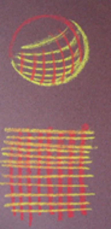
Even though stumping softens hatching and marked lines, they usually remain visible.
Pastel is worked "without a net," directly onto paper. Multiply your tests to acquaint yourself with lines, blends and fades, etc.
It is better to have to add lines, hatching and even color to an area rather than having to remove them: build up your effects gradually!
A very heavy first layer will no doubt be opaque, but will limit your options for enriching it later on. However willing your paper is, once it is fully saturated with pigments, you have just one option left: scraping with a knife or a utility knife…
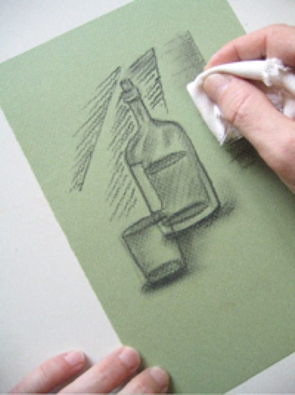
1.2. Blending and stumping properly
It is always tempting to make heavy use of rags and stumps, mix all the colors and blur all the contours. As a technique, this often leads to a duller work. The eye seeks in vain for a focal point… and, at best, takes away the impression of an unfinished work.
Conversely, an overly graphic drawing, based solely on lines, will likely lack consistency and smoothness.
Keep in mind: always build up your effects gradually to make the most of your subject!
1.3. Cooperate with the paper
Go with its texture: don't try to work on rough grain paper the way you would on smooth surfaces. Change your method… or turn the paper over: many drawing papers have different textures on each side.
Choose the shade to go with your subject's colors.
Practical advice: Expect color outcomes to be correlated to the color of your paper.
Sketch a flower or a piece of fruit on various kinds of paper using the same pastels:
Beige and pink shades cool hot, bright colors.
Black paper darkens colors but increases their strength.
Papers with neutral, cold colors (gray and blue) increase the brilliance of warm shades.
Colored papers intensify the shades of pastels.
Light color papers are right for delicate shades.
2. Oil pastels
2.1. Four mistakes to avoid
Pair oil pastels with dry pastels: the only thing they have in common is their name and highly concentrated pigments.
Above all, go for transparency: while they can be worked as a wash, their full richness shows to best advantage when applied in thick, textured layers.
Picking the wrong paper: If you use white spirit or turpentine–to dilute a pastel or touch up an error–, you should choose paper designed for oil painting.
Oil pastels do not require fixatives, so they can be used outdoors… provided you stay in the shade and avoid heat waves. You don't want your sticks to melt!
2.2. Five tips for keeping your work clean
One of the major problems with pastels is how to keep straying pigments from soiling your work. Several simple precautions help limit the risk:
Use blotters to shield areas that aren't being worked on.
Use a maulstick.
Spray a completed area with fixative (after covering the others).
Work on the center of the paper before moving on to the sides.
Turn your drawing board to keep the area being worked on in front of you.
2.3. Know how to tell yourself to "stop!"
Consider your work completed after finalizing the details and adding dabs of light. Trying to go back to an earlier stage once you've finished is always a mistake. You're better off putting up with an imperfection than damaging your work by struggling over an area or, even worse, trying to erase it and start over again.
Recommended product:
Mi-Teintes®